Why isn’t a share of stock just a worthless piece of paper?
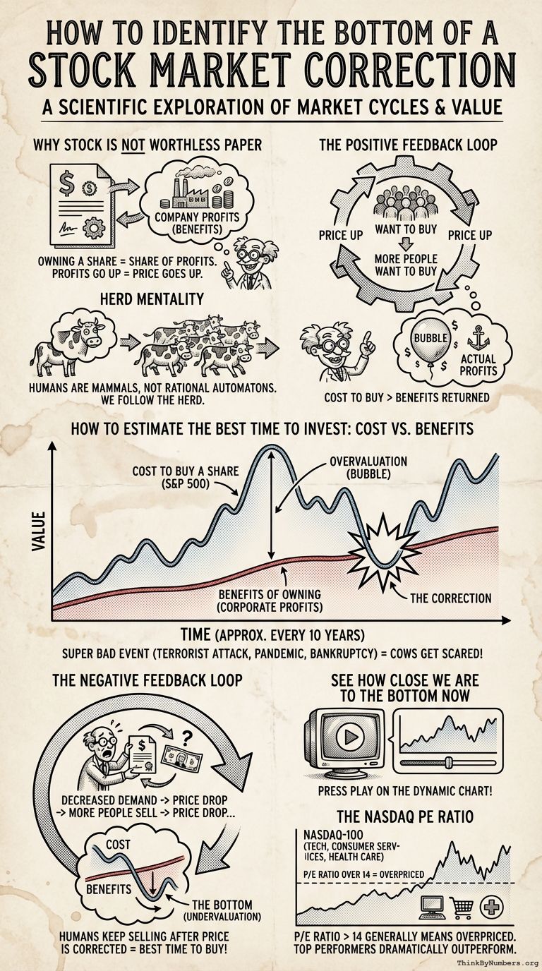
The fundamental value of owning a share of stock in a company is that it entitles you to a share of the profits earned by that company. This is why the price of a share of stock goes up when it’s profits go up.
The Positive Feedback Loop
However, the price of a share of stock also goes up when more people want to buy it. This causes a positive feedback loop of more people wanting to buy it making the price go up. Then, the price going up makes even more people want to buy it making the price go up. Then, the price going up makes even more people want to buy it making the price go up. Then, the price going up makes even more people want to buy it making the price go up.
Bubbles
All the while, the profits produced by the company aren’t going up that fast. When this generally happens to the overall stock market, this causes what’s known as a “bubble”. In a bubble, the cost to buy a stock is greater than the benefits returned to the shareholder.
Herd Mentality
It is not rational to pay more for something that the value returned to you. However, humans are not rational automatons. Instead, humans are mammals like cows. Hence, we see the best example of the phenomenon of “herd mentality” in the stock market.
How to Estimate When It’s the Best Time to Invest
This overvaluation of the stock market is illustrated in the following chart with 2 lines.
- The Cost to Buy a Share of Stock (BLUE) – More specifically, the current value of the S&P 500 index. This generally represents the cost of a share of stock for an average company.
- The Benefits of Owning a Share of Stock (RED) – More specifically, corporate profits after taxes as published by the St. Louis Federal Reserve. This generally represents the immediate financial benefits of owning a share of stock in an average company.

The Correction
You can see that every 10 years or so, something super bad like a terrorist attack or a pandemic happens or some large financial institution goes bankrupt and all of us cows get real scared! As a result, people trade their risky investments for tiny portraits of dead presidents, which are considered more likely to retain their value for some reason.
Then, instead of a positive feedback loop, there’s a negative feedback loop. The decreased demand for stocks causes the price to drop. Then the drop in price makes more people want to sell causing the price to drop. Then the drop in price makes more people want to sell causing the price to drop. Then the drop in price makes more people want to sell causing the price to drop.
Eventually, the cost of buying a stock (RED) comes back down to a level that matches the benefits of owning a stock (BLUE). This is the correct price of the stock, hence the phenomenon is called a “correction”.
Again, humans are not rational automatons, but mammals. So they keep selling even after the price has already been corrected. Thus, the stocks become undervalued. This period represents the end of a market correction and the best time to buy.
See How Close We Are to the Bottom Now
Hey, person from the future relative to my past self typing this! Press the play button on the dynamic chart below to see how close you currently are to the bottom.
var tradingview_embed_options = {}; tradingview_embed_options.width = '640'; tradingview_embed_options.height = '400'; tradingview_embed_options.chart = 'eYKrpPhe'; new TradingView.chart(tradingview_embed_options);
Corporate Profits vs the S&P 500 by mikepsinn on TradingView.com
The NASDAQ PE Ratio
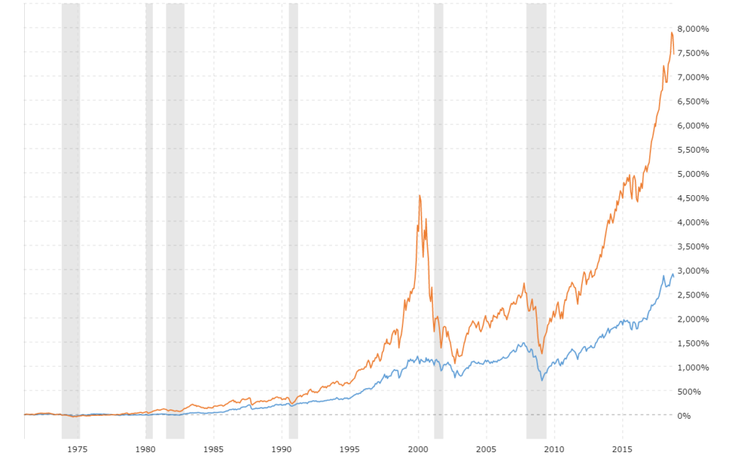
The Nasdaq-100 is the average of 100 of the largest domestic and international non-financial companies listed on the Nasdaq Stock Market based on market capitalization. It is home to the four companies who have touched the trillion-dollar mark in the US: Apple (AAPL), Amazon (AMZN), Microsoft (MSFT), and Alphabet (GOOG, GOOGL).
The fact that the Nasdaq-100 is heavily allocated towards top-performing industries such as Technology, Consumer Services, and Health Care, has allowed it to dramatically outperform the S&P 500 over the long term.

https://www.macrotrends.net/2528/dow-jones-vs-NASDAQ-chart
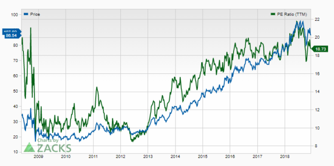
The Nasdaq is not really representative of the overall market, so the Fed’s earnings chart doesn’t apply as well as it does for the S&P 500. For the Nasdaq, the best value estimate I can find to overlay is the price-to-earnings (P/E) ratio at https://www.zacks.com/stock/chart/NDAQ/fundamental/pe-ratio-ttm

https://www.zacks.com/stock/chart/NDAQ/fundamental/pe-ratio-ttm
The oldest data I can find for that is 2009. However, it appears that a P/E ratio over 14, generally means it’s currently overpriced.
Please share any links to more indicative charts in the comments!


Comments