
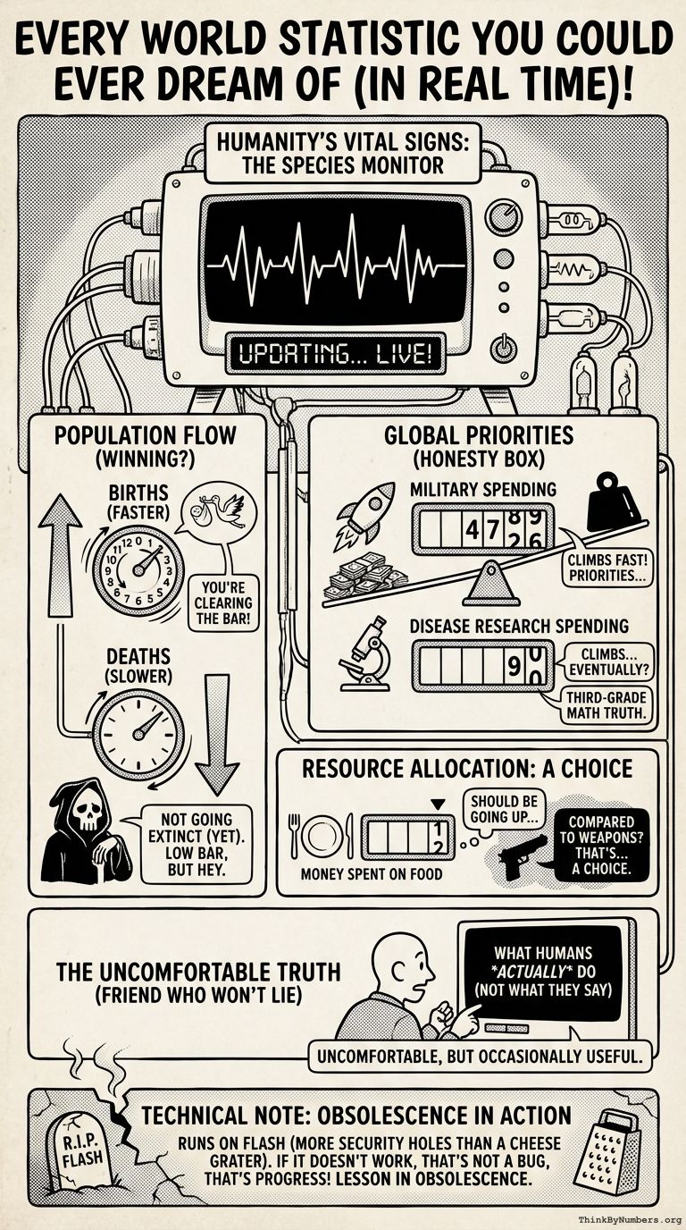
Humanity's vital signs, updating in real time. Think of it as a heart rate monitor for the species, except the patient keeps making questionable decisions.
This widget tracks births, deaths, money spent on various things, and other metrics that reveal what we're doing with our opposable thumbs. You're watching humanity happen, live. It's like reality TV, but everyone's an extra and nobody knows the plot.
Some observations while watching:
-
Births vs Deaths: The birth counter moves faster than the death counter. You're winning at not going extinct, which seems like a low bar but you've cleared it.
-
Military Spending: Watch how fast this number climbs compared to, say, spending on disease research. It reveals your priorities with the honesty of third-grade math.
-
Money Spent on Food: This should be going up. If it's going up slower than money spent on weapons, that's... a choice you're making.
The widget shows you what humans actually do, not what they say they do. It's like having a friend who won't lie to you. Uncomfortable, but occasionally useful.
Note: This runs on Flash, a technology that died because it had more security holes than a cheese grater. If it doesn't work, that's not a bug, that's progress. Consider it a lesson in obsolescence.
Comments